Design system
Every color, text style, surface, image and component Nouva is built from. The styles on this page are live, so it always shows the current system.
How to use
Type /design-system in the Agent panel and describe the page you want. The Agent reads this page, the color and text styles and the components below, then builds the page from instances of the existing components.
/design-system Build a Customers page at /customers with a landscape hero, three Feature Cards, testimonials and the FAQ. End with the closing CTA from Home.
Recommended model: GPT 6.1 Sol or higher.
01 · Colors
Nouva's interface is a deep night blue: a near-black page, three surface steps for cards and hairline white borders. It has no accent color. Warmth comes from the landscape photography, so the UI stays quiet around it.
Backgrounds
Dark/Background
rgb(8, 12, 18)
Dark/Surface
rgb(14, 19, 29)
Dark/Surface 2
rgb(15, 21, 32)
Dark/Surface 3
rgb(18, 25, 38)
Lines
Dark/Border
rgba(255, 255, 255, 0.05)
Light/White 50%
rgba(255, 255, 255, 0.5)
Text
Text/Primary
rgb(255, 255, 255)
Text/Secondary
rgb(153, 160, 176)
Light/White 70%
rgba(255, 255, 255, 0.7)
Light/White
rgb(255, 255, 255)
Text/Primary Dark
rgb(9, 9, 11)
02 · Typography
One family, Onest, in regular weight with tight tracking on headings. Size and spacing carry the hierarchy, so there is no bold display style and no second font.
Headings
Heading 1 · 60px / 1.0 / -0.04em · Page title, once per page
Words that work. Every single time.
Heading 2 · 48px / 1.05 / -0.04em · Section titles, under an Eyebrow
Three shifts that change how your team works.
Heading 3 · 36px / 1.15 / -0.04em · Large statements inside a section
Your whole team. One platform.
Heading 4 · 28px / 1.3 / -0.02em · Plan names and column titles
Other tools
Heading 5 · 20px / 1.3 / -0.02em · Card titles and group labels
Track your output
Heading 6 · 18px / 1.4 · Questions, names and small titles
Sarah Mitchell
Body
Body Large · 18px / 1.4 · Hero subtitle and lead lines
An AI content tool that writes, tracks, and scales your team's output.
Body Medium · 16px / 1.45 · Regular copy and card descriptions
Set targets, track progress and let Nouva keep your team on pace.
Body Small · 14px / 1.5 · Roles, captions and small print
Head of Marketing at Volta
Other
Other/Button Text · 15px / 500 · Inside buttons only
Try for free
Other/Tag · 12px / 500 / uppercase · Inside the Eyebrow and badges only
What Nouva does
Other/Blog Heading · 28px · Reserved for article titles
Article title
03 · Radius
Corners get smaller as elements get smaller. Cards, panels and landscape frames use 16px, buttons and insets 12px, media inside a card 10px.
16px
Cards, panels, landscape frames
12px
Buttons, inputs and insets
10px
Media inside a card
04 · Spacing
An 8px rhythm with a few larger steps for sections. Measure against Home before adding a new value.
8px
Lines inside a group, list rows
12px
Eyebrow to title, button rows
16px
Card grids, title to subtitle
24px
Card padding
32px
Inside large cards
48px
Section head to a panel, hero stack
64px
Section head to content
96px
Section padding top and bottom, 40px left and right. The hero uses 150px on top
05 · Surfaces
Depth comes from dark blue steps and a hairline border, never from shadows. Each level sits one step lighter than the one behind it.
Dark/Background · page and sections
Dark/Surface · cards and forms, 16px corners, 1px Dark/Border
Dark/Surface 2 · insets inside a card, 12px corners
Dark/Surface 3 · the top step, for chips and small controls
Pages and sections sit on Dark/Background with no fill of their own.
Cards and forms are Dark/Surface with a 1px Dark/Border. Each nested level steps up one surface.
Landscape photos are the only decoration. No shadows, glows, gradients or accent colors in the UI.
06 · Components
Every page is built from these. Place them as linked instances, change their words through their controls and pick a variant before drawing anything new.
Actions
Button
Primary for the main action, OutlineWhite beside it for a second choice. Mobile variants on Phone.
Labels
Eyebrow
Above every section title.
What Nouva does
Cards
Feature Card
Rows of three, each with its own product shot.
Track your output
Nouva monitors your daily output, so nothing slips through.
Feature Block Card
Wide cards with a product shot, a title and a button, stacked in Built for every workflow.
Your output, growing every day
Nouva tracks everything your team produces and shows you exactly where it grows.
Benefits Card
Short proof points in a grid of two by three.
Testimonial Card
A real quote with a photo, name and role. Content comes from the Testimonials collection.
Nouva cut our team's workload in half.
Sarah Mitchell
Platform Engineer
Landscapes
07 · Imagery
Nouva's mood comes from cinematic landscapes at dusk: amber light, deep blue skies and dark ridges. They fill the hero, the panels behind key sections and the closing CTA. Product shots sit on dark cards in front of them.
Landscapes

Desert at dusk
Hero, full bleed

Canyon
Panel behind Built for teams

Night hills
Behind the Comparison
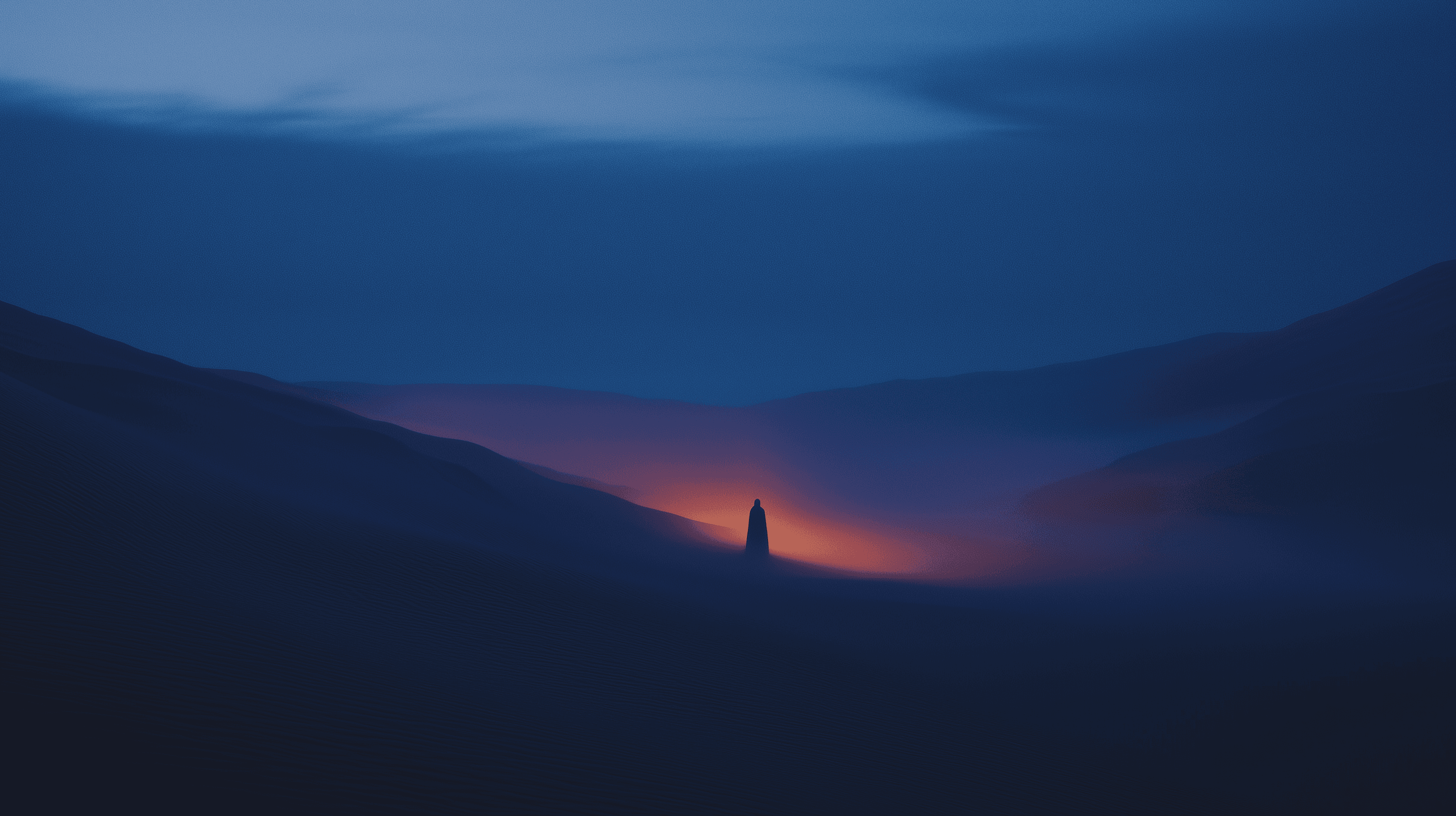
Horizon
Closing CTA
Product shots

Track your output
Feature Card

Stay ahead of goals
Feature Card

See where time goes
Feature Card

Output growth
Feature Block Card

Every format
Feature Block Card

Minutes, not hours
Feature Block Card
Images page
The full set from the Images design page. Swap any of them through the product-shots and landscapes skills.
Image 1
Horizon landscape, 1920 × 1080

Image 2
Square, 1000 × 1000

Image 3
Square, 1000 × 1000

Image 4
Square, 1000 × 1000

Image 5
Portrait, 800 × 1200

Image 6
Portrait, 800 × 1062

Image 7
Landscape, 800 × 616

Image 8
Landscape, 800 × 616
Landscapes go full bleed or inside a 16px panel, with text and cards on top. Keep text readable over the brightest part of the photo.
One landscape per section, and never the same one twice in a row.
Product shots sit inside cards, on Dark/Surface. No bare screenshots on a landscape.
Use project imagery and what the user provides. No stock photos or invented product screens.
08 · Sections
Larger modules that carry a whole section. Their content lives inside the component, so editing one changes it everywhere it appears.
Pricing
The only way to show plans. Monthly and yearly live inside it.
Accordion
Every FAQ. Questions are shared with Home.
Contact Form
The form on /contact, with Loading and Success states built in.